flex container : 전체적인 정렬이나 흐름에 관련된 속성 / 전체에 관여
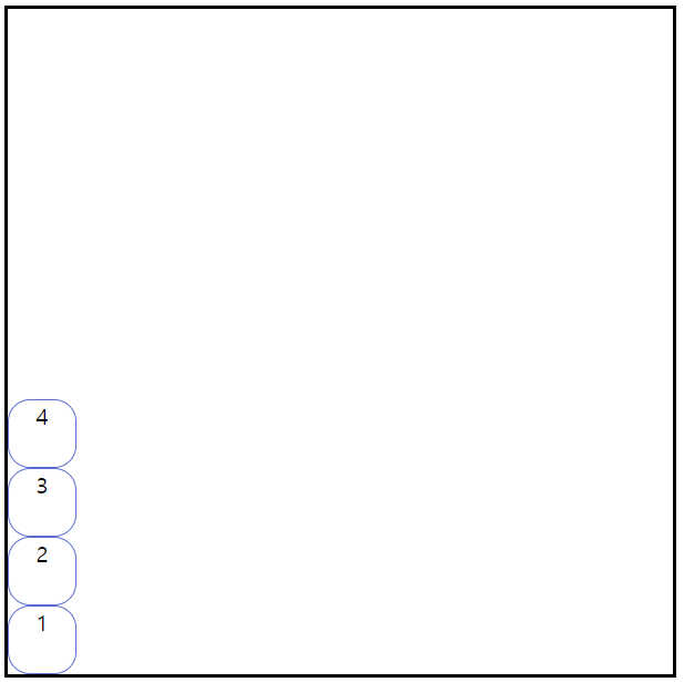
▶ flex-direction
- row : 좌→우
- column : 위→아래
- row-reverse : 우→좌
- column-reverse : 아래→위

▶ flex-wrap : flex item이 많은 경우 넘어가는 설정
- wrap: 넘어간 크기만큼 개행되어짐
- wrap-reverse : 아래부터 정렬되어짐
- nowrap : 기본속성 : 개행하지 않겠다는거 -> 크기가 줄어듬


▶ flex-flow : flex-direction과 flex-wrap 속성을 설정하기 위한 단축 설정 ( 기본값 : row nowrap )
.flex-container{
	display:flex;
    flex-flow:row wrap;
    /* 기본 꼴 : flex-flow : flex-direction || flex-wrap */
}
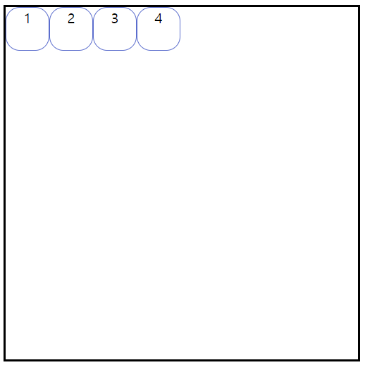
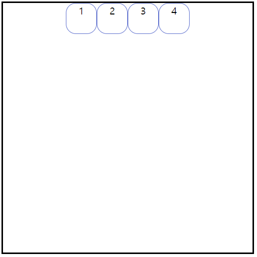
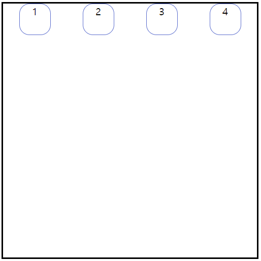
▶ justify-content : main axis를 기준으로 flex-item을 정렬하는 속성
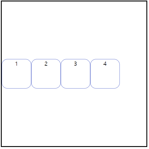
- flex-start : 좌측으로 정렬
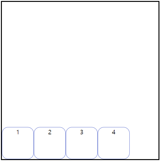
- flex-end : 우측으로 정렬
- center : 중앙정렬
- space-around : 균등분할
- space-between : 첫번째 요소와 마지막은 끝으로 붙이고 그러고 나서 균등분할!

▶ align-content : cross axis를 기준으로 flex-item을 수직정렬!
- 속성은 justify-content와 동일
- wrap:nowrap일때만 유효함 - flex line을 정렬


▶ align-items
- align-content는 전체가 한묶음으로 움직이는 느낌이라면 item은 각 나눠지는 파트가 분할되어져서 움직이는 느낌 -> 예시 만들어서 하는게 나을듯
- flex line을 기준으로 정렬하는 반면, align-content는 flex line을 정렬한다


▶ text-align : text와 관련된 정렬을 의미

